[1] Brand Revamp[2] Performance Optimization[3] Design System
Prologue
Since 6 yrs of establishing QuillAudits the branding stayed the same and just the contents got updated. Web3 as an industry is very fast paced and young, brand trust here can be elevated with better positioning which Quill was lacking. When I joined as an intern there was a very urgent revamp carried by my senior but since it’s urgency it was a broken system and scaling it was a hurdle.
After convincing stakeholders multiple times I got the opportunity to revamp the entire brand system, but since the trust was low I had to play it safe and also not give up on expressing well.
Overview
QuillAudits is a Web3 Security Audit Firm, we audit codebases and smart contracts of projects/organisations. Our product offering is not only limited to auditing but is extending towards OPSEC, Monitoring, Research, AI-Audit Tooling, Vigilant Squad etc.
What did we do
With this revamp we wanted to create an identity for Quill, one forethought we had was to not touch the logo since the company was established 6 years back and had a roster of around 900 clients and a chance to get recurring deals from them moving forward.
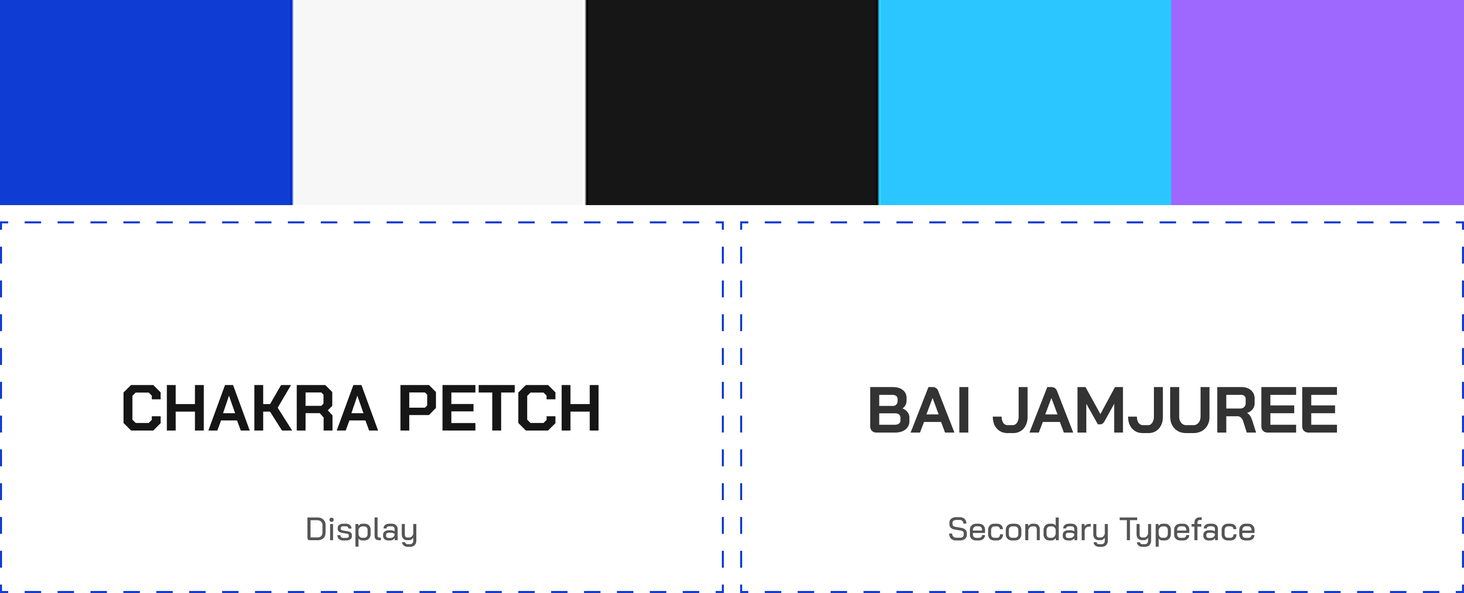
We picked up all the broken bits started to create a brand system with the main aim to help scale across web, product and socials. Working closely with management and marketing teams I got enough context to move forward. From color, typography, iconography and a new illustration style we made sure no stone went unturned.
Web Design
The homepage was where we focused mainly since that is the organic part of the conversion funnel. Apart from that we used Individual CMS controlled service pages aiding SEO and I had to find ways to create a scalable template so the marketing team can utilise it well. There were a total of 56 web pages including service pages and pages across company, community, research etc. We did get a lot of visitors through our hack analysis and blogs and I made sure those were conveying the information well with a delightful UX.
Illustration System & Motion
During the 1st iteration the then visual designer made a 3D icon system but once he left the scalability took a hit and using video assets made the performance dip and as per our user data of 6 months the scroll depth was at 40% and performance score at 62%.
To tackle that I took it into my own hands to create a new style which represents the brand better. I used isometric elements combined with an ASCII Aesthetic for backgrounds. As a security company our lives were 0 and 1 - The absolute truth and I felt what more to represent it well than ASCII.
Mix of SVG Illustrations and animations using GSAP. The animations now get rendered in the DOM with sizes ranging ~100KB, significantly increasing the performance.
Observed Impact
[1] Increased conversion / leads through simplified user flows and engaging interactions
[2] Enhanced visibility (3X) and image through the audit landscape positioning QuillAudits not just as a technical powerhouse but also attach a brand image with it.
[3] ~25% increase in user engagement time (past 6 month data)
[4] Increase in website performance due to using SVG assets and animations.
Footnotes
Working alongside management and a range of departments and pulling off this project since this was my first project which I lead was surreal. Learnt a lot, had to unlearn a lot too. Still in my eyes this is nowhere near perfect, a brand is a living plant and as it grows it matures and keeps on attaining different forms. That’s how I see it. Thanks for reading till the end :)
If you like this, you’ll also like: